The River Cross Eco-Retreat
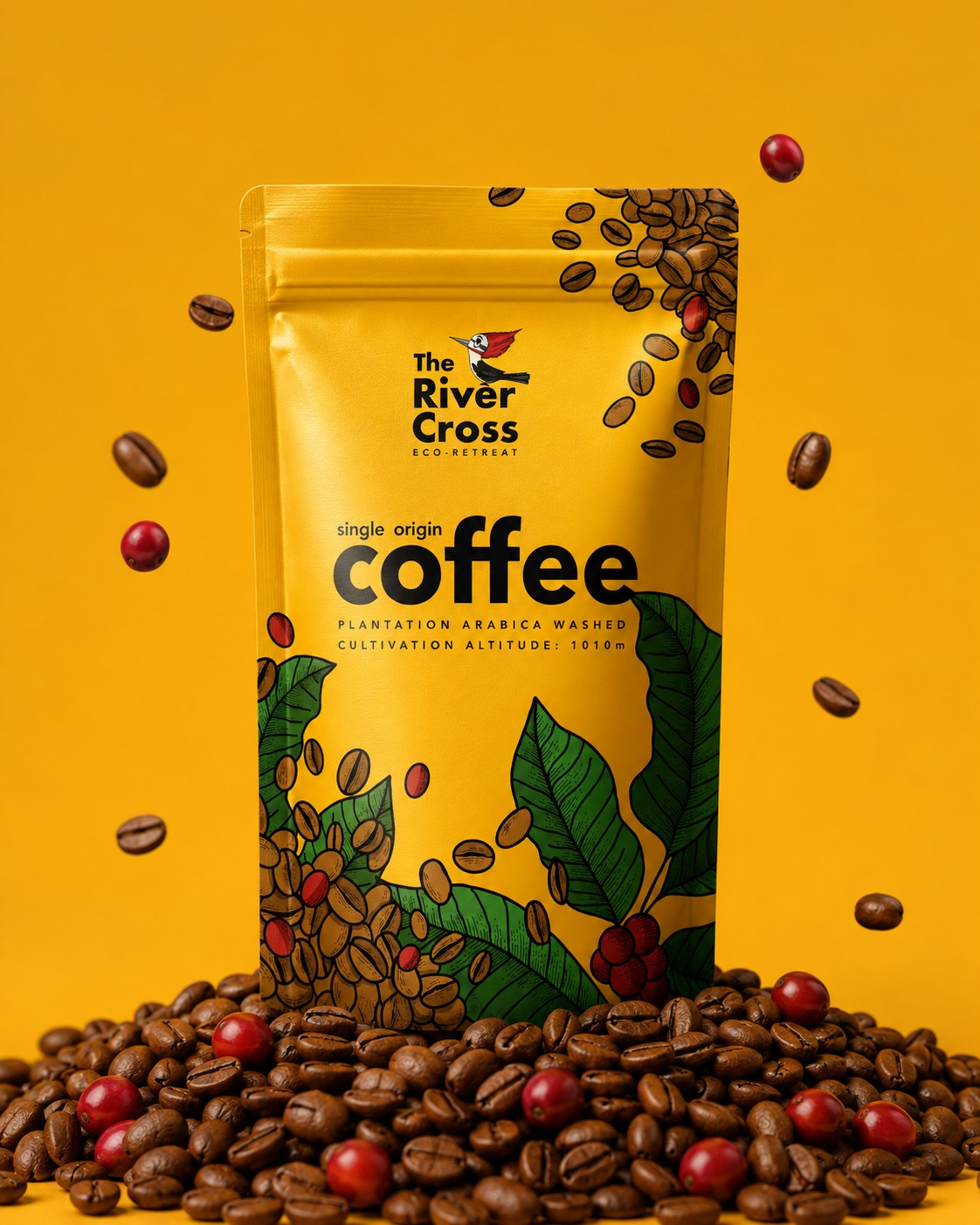
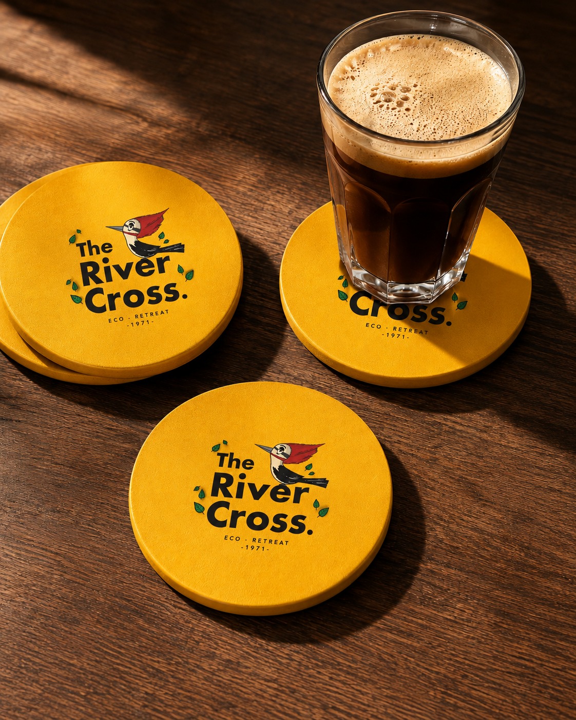
The River Cross identity was developed to reflect the retreat's close relationship with its natural surroundings and estate-grown produce. At the centre of the logo is a locally found woodpecker, selected as a distinctive visual symbol of the property and its biodiversity.
The bold yellow palette gives the brand warmth, energy and immediate recognition, while the hand-drawn bird and leaf elements introduce a more organic, approachable character. Strong typography balances the illustrative details, allowing the identity to remain clear and versatile across signage, coasters and hospitality applications.
Brand identity · Logo design · Illustration · Packaging design · Visual application development
The single-origin coffee packaging extends the same visual language through illustrated coffee leaves, beans and ripe cherries. The design connects the product directly to the plantation while maintaining a bright, contemporary shelf presence.