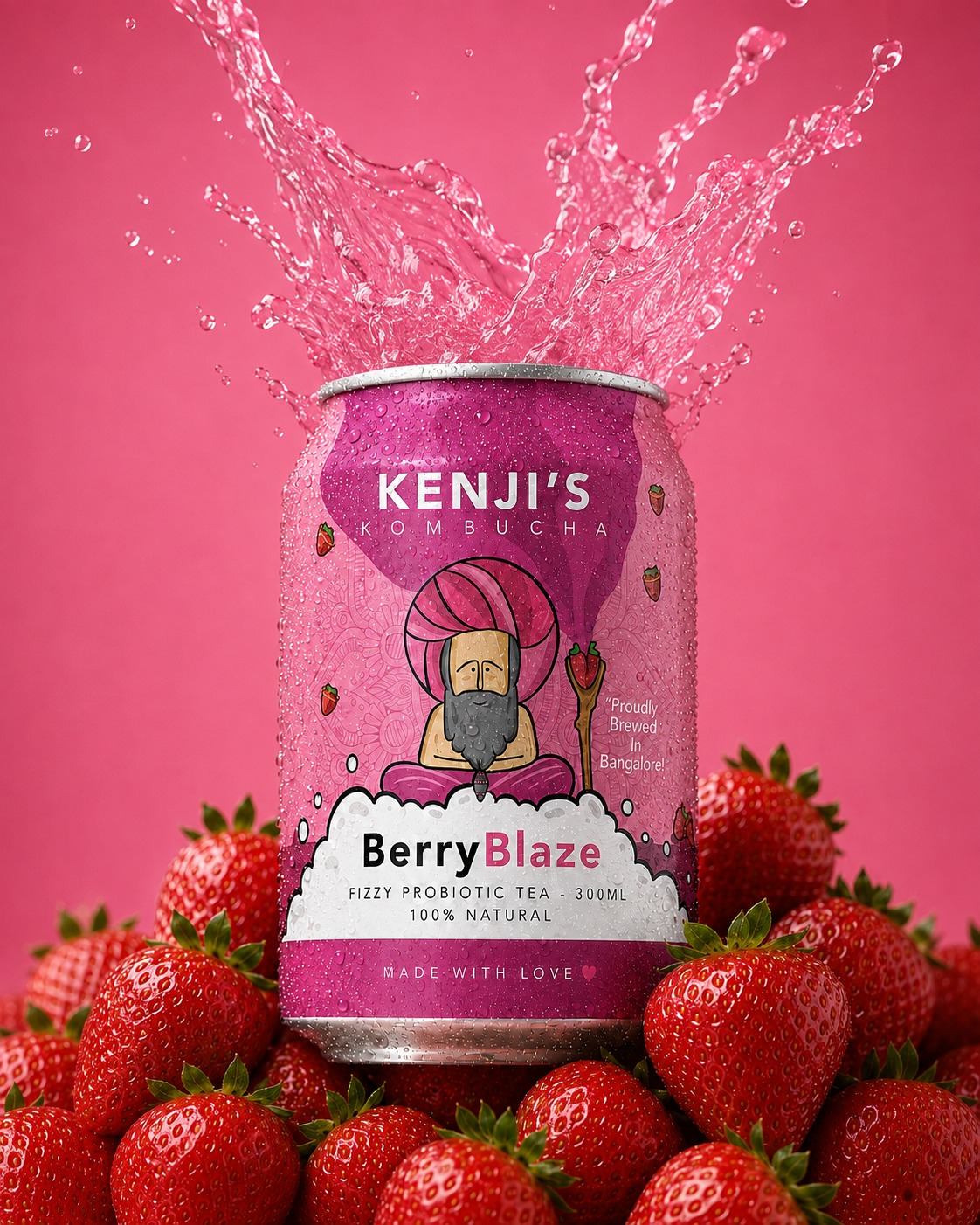
Kenji's Kombucha
Founded by two Indian entrepreneurs, Kenji's Kombucha set out to make a naturally fermented, health-forward drink feel approachable and energetic rather than clinical — pitched squarely at a fitness-conscious audience between eighteen and forty. The brief called for something youthful and distinctly Indian, without losing its credentials as a wellness product.
At the centre of the identity was a rough sketch handed over by the founders — a seated "baba" figure proposed as mascot. I developed it into a full illustrated brand character, with a consistent visual language and a colour system flexible enough to carry the whole range, giving the brand warmth, humour, and instant shelf recognition.
Brand identity · Mascot development · Illustration · Packaging design · Colour system · Visual direction · Concept development · Client & stakeholder management
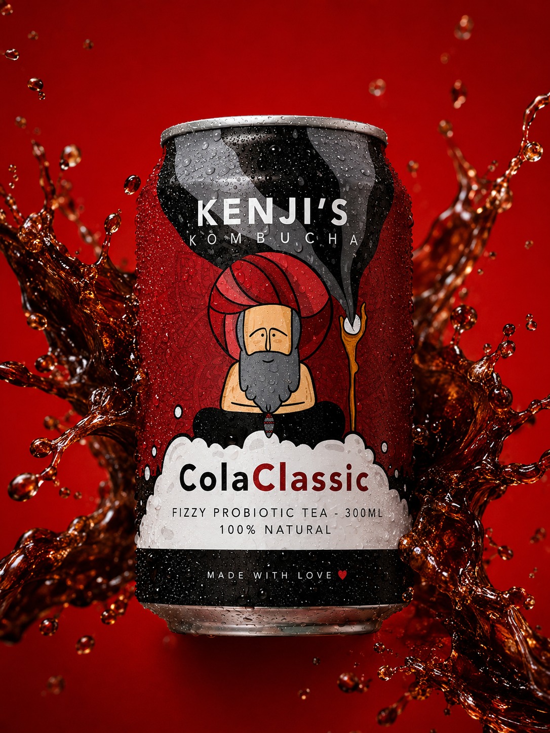
Each flavour carries its own bold, high-energy palette, paired with flavour-specific illustration and graphic detail around the baba. A central white label holds the hierarchy steady — product name and claims stay legible even as the artwork around them gets busier.
Traditional Indian visual references — pattern work, ornament, colour sensibility — sit underneath contemporary typography and flat, poster-like illustration, keeping the range feeling current rather than folkloric.
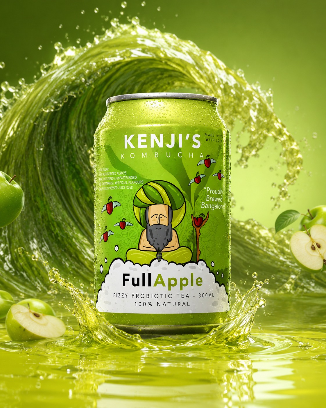
The finished system was built to do three things at once: hold shelf attention, keep flavours instantly distinguishable, and carry a personality distinct from the category's usual restraint — a playful, scalable identity across the full flavour range.