K.C. Das
K.C. Das, a heritage Indian sweets institution, commissioned a packaging system for their new range of dry fruits and nuts, with a mandate to feel bold and contemporary while leaving their established colour palette and wordmark untouched.
The concept emerged from an observation made while waiting outside one of their outlets. At a moment when public discourse felt increasingly divisive, the counter itself read as a quiet anomaly — drawing custom across religion, generation, and background into a single queue, united by nothing more than a shared appetite. That contrast, between a fractured conversation and an unexpectedly unifying retail ritual, became the premise for the design.
Concept development · Design · Illustration · Packaging material selection · Execution
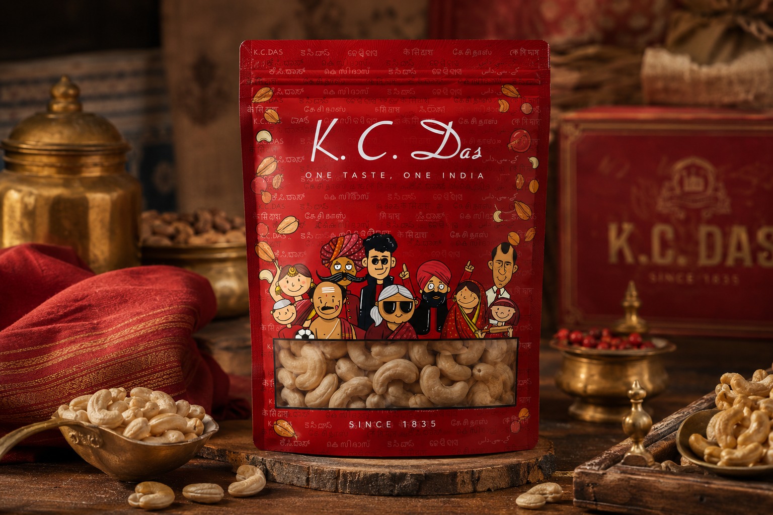
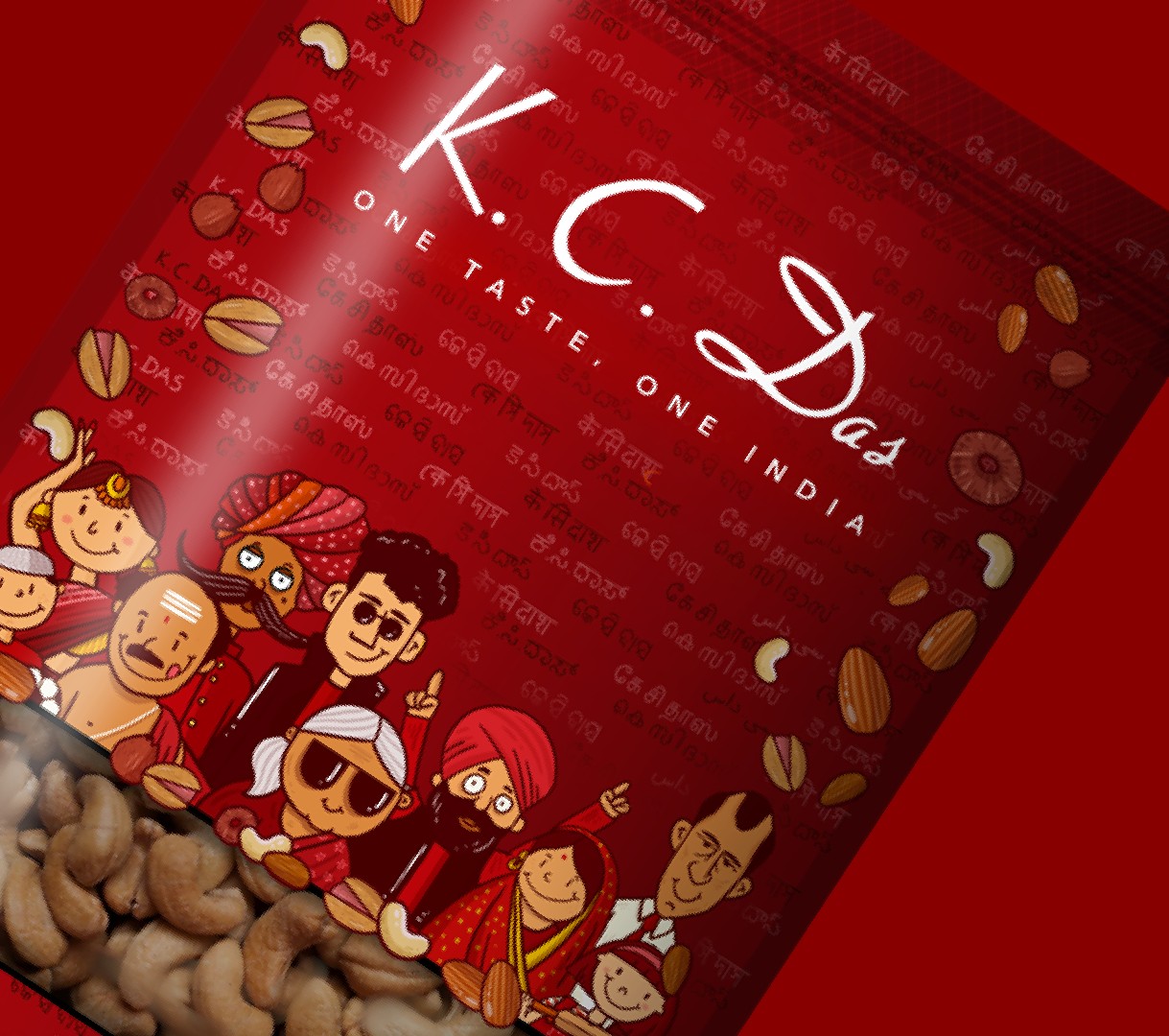
Executionally, the brand name is inscribed across the pack in a lattice of Indian scripts — a nod to the linguistic plurality of the customers it serves. Layered over this are hand-illustrated figures spanning generation, dress, and community, gathered as if in celebration. A die-cut window at the base gives the product itself a place in the design, inviting a more tactile encounter before purchase.