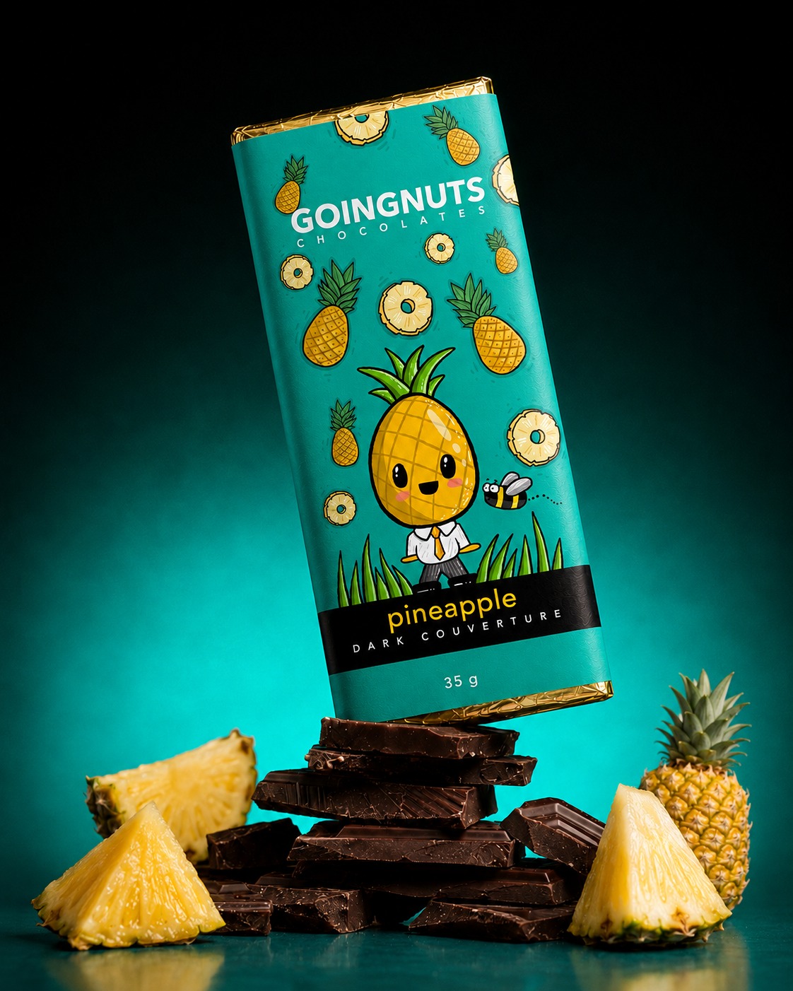
GoingNuts Dark Chocolates
GoingNuts' dark chocolate range was rebranded to stand out on a crowded supermarket shelf. The brief was to move away from the conventions of premium chocolate packaging and build something bolder and more playful, without giving up shelf-ready polish.
The result is a flavour-led system built on vibrant colour, original illustrated characters and ingredient-inspired pattern work. Each variant carries its own personality within a shared structure, so the range reads as a family while staying easy to tell apart at a glance.
Brand refresh · Packaging strategy · Character illustration · Flavour differentiation · Material & finish selection · Print coordination · Stakeholder communication
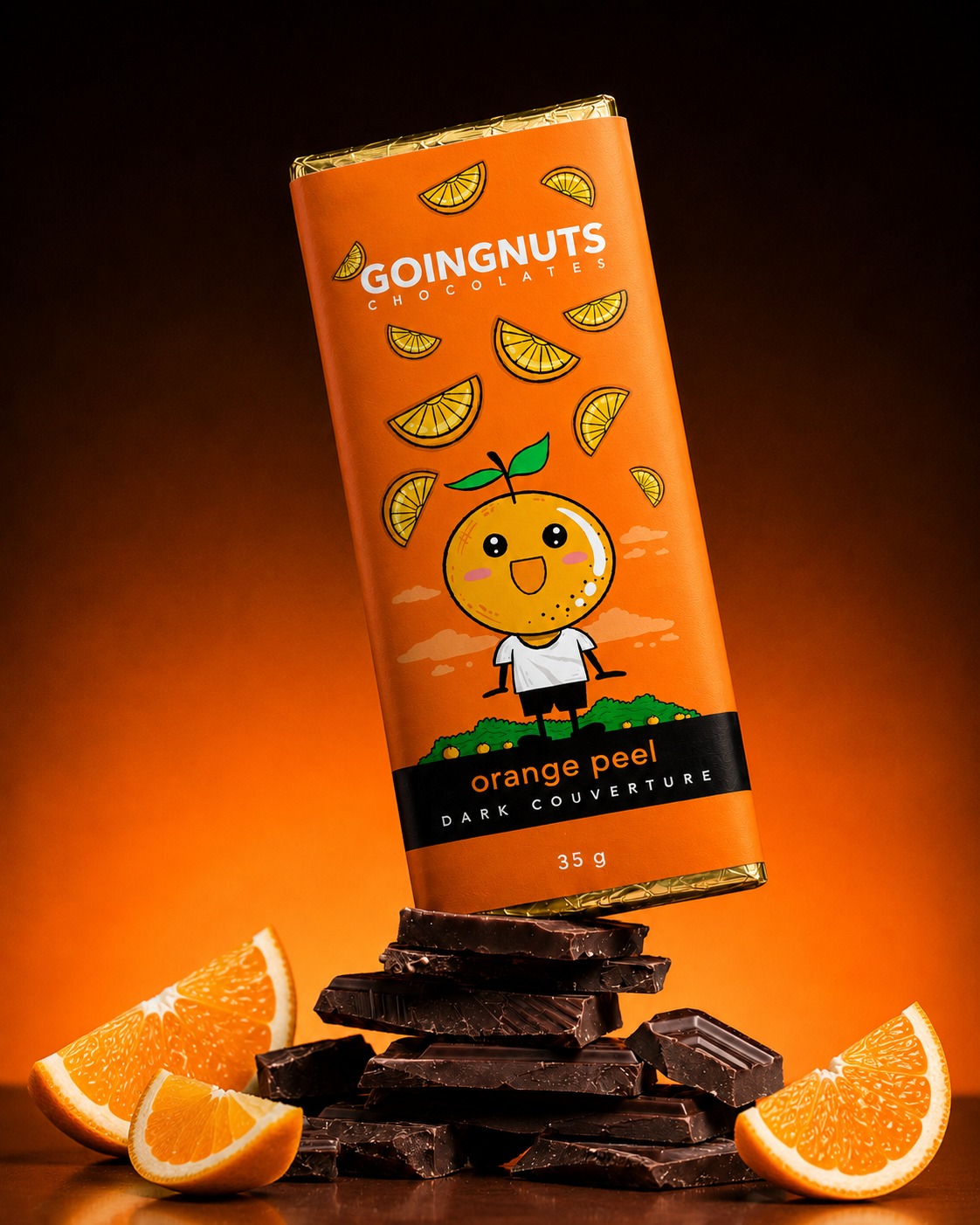
Each flavour gets its own colour world and character — from a strawberry-loving dinosaur to a citrus mascot in shorts — while the wordmark, layout grid and black nameplate stay constant across the range.
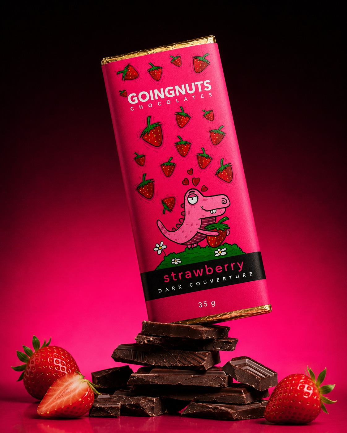
Underneath the playful illustration, the material finish does the premium work — subtle embossing and metallic foil detailing on the wrapper edges keep the range feeling considered rather than novelty-grade.
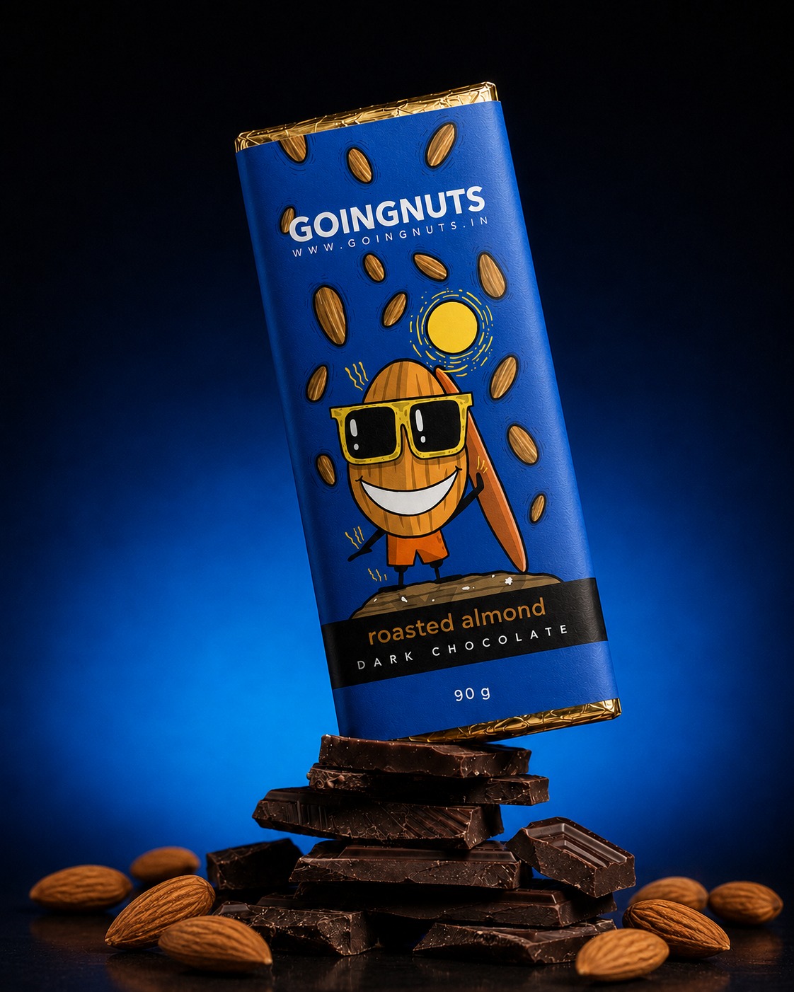
A packaging system built to be spotted fast, told apart instantly by flavour, and still hold its own as a considered retail product rather than a purely playful one.